Help Center AffiliCon
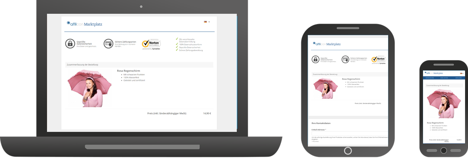
Checkout in Responsive Design
- Dennis Heng (Unlicensed)
- Elizaveta Herdt (Unlicensed)
- Sebastian Radatz (Unlicensed)
- Tim Langenbahn (Unlicensed)
Our homepage, the administration area for products as well as order forms are optimized for mobile use, respectively response.
They are properly displayed on PCs as well as on all mobile devices.
Currently the order form is set as the old version by default.
To activate the design optimized for mobile use, please do the following:
1. After logging in to affilicon.net, create a new product in your administration area or choose an already existing product. Click "Edit".
2. Select the "Checkout configurator" tab.
3. Click “Design/Layout”.

4. In the drop-down menu "Select theme" choose “Modern (flat Design / responsive)”.
5. Click “Apply”. You can check the mobile version by using "Preview".

Related content
If you have any more questions, please write us via https://support.affilicon.net/contact/ or clients@affilicon.net.